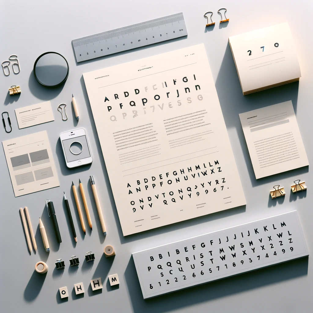
In the digital landscape, typography transcends mere text on a screen; it is a critical component that shapes user experience, communicates brand identity, and enhances readability. Let's dive deeper into why typography is not just important but essential in web design and how you can master it to elevate your digital presence.
Decoding Typography:
Imagine typography as the attire of your written content—how it dresses to make an impression. It involves choosing the right typefaces, adjusting sizes, spacing, alignment, and more to ensure that the text is not only readable but also engaging. This art and technique of arranging type elevate the aesthetic appeal and the functionality of textual content online.
Typography's Role in Web Design: A Closer Look: Typography is the backbone of web design, influencing user engagement and communication effectiveness. It's not just about making things look pretty; it's about creating a seamless path for users to navigate through your content.
Visual Hierarchy & Balance: Good typography guides the user's eye across the page, establishing a flow that is intuitive and harmonious. By differentiating headings, subheadings, and body text, it sets the stage for where users should look first, second, and so on.
Brand Identity: The fonts you choose become synonymous with your brand. They can evoke emotions, convey messages, and set the tone for your brand's personality. Whether it’s professional, whimsical, or somewhere in between, typography is a silent ambassador of your brand.
User Experience: Beyond aesthetics, typography impacts how easily users can consume your content. Readability and legibility are paramount, determining how long users stay and engage with your content.
Enhancing Web Typography; Tips and Tricks: Improving your website's typography means paying attention to the details that contribute to an outstanding user experience
Ideally, stick to two fonts—one for headlines and another for body text. This keeps your design clean and cohesive.
Font Pairing: Fonts should complement each other and align with the overall design theme. Contrasting a serif with a sans-serif font is a common practice that works well.
Test & Experiment: Typography is not one-size-fits-all. What works for one site may not work for another. Testing different fonts on your site can reveal what best suits your content and design.
Understand Your Brand: Choose fonts that resonate with your brand’s voice and personality. Typography is a crucial part of your brand identity, so it should reflect who you are and what you stand for.
Prioritize Readability: Above all, ensure that your text is easy to read on different devices and screens. This means considering font size, color contrast, and spacing.
Choosing the right typography is about striking a balance between beauty and functionality. It's about creating a visually appealing design that enhances the user experience, conveys your brand's identity, and makes your content accessible and enjoyable to read.
Have a project in mind?
